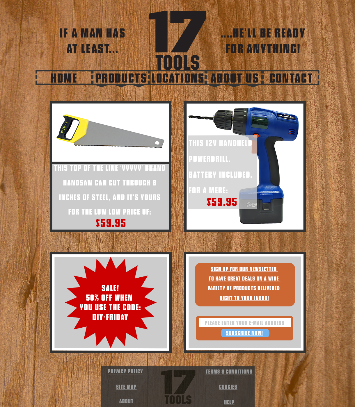
This is the 17 Tools website I designed during my Cert 4 Web Development course at TAFE in 2013.
It is essentially a result of my interpretation of the Logo as looking similar in style to the way information was stamped onto wooden shipping crates in the 17th to 19th Centuries.
I thusly chose a wood-plank background, and a font that emulated a similar style for the majority of the site. The idea was to make the entire site look as though it were stamped onto the side of a wooden crate.
Unfortunately, due to my less than artistic imagination, I could not come up with a way to make the images look both stamped on, and easy to view. So I sacrificed the theme somewhat in order to maintain view-ability. The borders for the featured content are thus acting more like a portal. Being similar in style to the stamped ink, whilst entirely encapsulating (and thus insulating) content which is not at all similar.
I am quite proud of how this site turned out, despite it’s shortcomings. I feel as though it was an important step toward the development of my aesthetic capabilities.

