
This is the Boostworks website concept I designed during my Cert 4 Web Development course at TAFE in 2013.
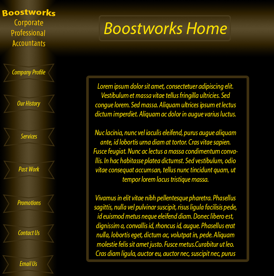
It is the very first concept I designed for the course. It is indicative of my thinking in the early stages of the course, that darker backgrounds with brighter content are superior to the inverse, and that vertical menu’s are more accessible than horizontal.
I thusly chose to implement both design features into the site’s concept. My initial idea was Green on Black, but upon recalling the target audience (accountants), I decided against using green and went with more academically neutral light brown and yellow. The simplistic style is due primarily to my inability to come up with anything more creative in the alotted timeframe, but it does make sense for an accountant’s website to be somewhat businesslike and prefer function over form.
Looking back on this concept, I am grateful for the strides I have taken toward better design principles.