
This is the Surf Australia website concept I designed during my Cert 4 Web Development course at TAFE in 2013.
It was created in the vein of a more modern site. Horizontal menu, vertical content organisation segregated into primary, divisional and secondary. It was also the first concept in which I included the information footer.
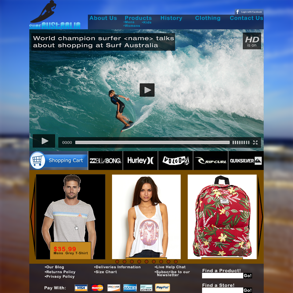
My choice to attempt to emulate a more current website design meant that I had to create the website in distinct sections, and cram each one full of content. The header obviously came first, in which I placed the logo and the navigation menu, as well as a social media link.
The menu, once again horizontal, this time also features sub-menu’s accessible directly to any viewer of the page without requiring prior menu interaction. This saves on un-necessary clicking whilst still allowing for categorisation of pages.
The main content is segregated into sections, divided by a thin row of alternate content, in this case, brand advertisement and a link to the shopping cart. The main content is primarily intended to generate sales, so the top section contains a promotional video, whilst the bottom contains actual product information.
The footer is configured in a typical manner, crammed with links to less prominent sections of the site, and some extraneous functionality.
I am pleased with how this design turned out, though the content segregation leaves something to be desired and the organisation of features is slightly inadequate, I find the overall quality of the design to be personally satisfactory.