


Live Demo at:
http://oldsite.sam-shannon.id.au/
This is my very first showcase website.
Built for a TAFE course (of course) in Web Development in 2013, the vast majority of the content on it was web development related.
I eventually added more diverse content (programming/networking related mostly) but switched to the WordPress version before adding much pure art (despite having done most of it before the showcase even existed).
As for the design itself… I am still partial to dark backgrounds with lighter text (I find it easier on the eyes), but the Oranges and Light Blues and Dark Greens I now find (despite being suitably contrasting) somewhat garish. The new WordPress site of course now uses much less Orange and I think it works a lot better (it also helped that I didn’t have to design it myself).
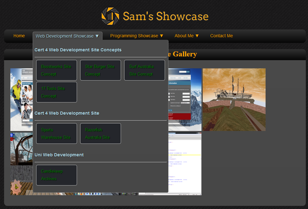
My shining pride and joy is the nav menu though. Entirely CSS driven, I was particularly proud of managing the seamless tabs (the bottom connects directly to the expanded menu without border clipping), show-hiding elements based on hover, and the way I handled subcategorisation.
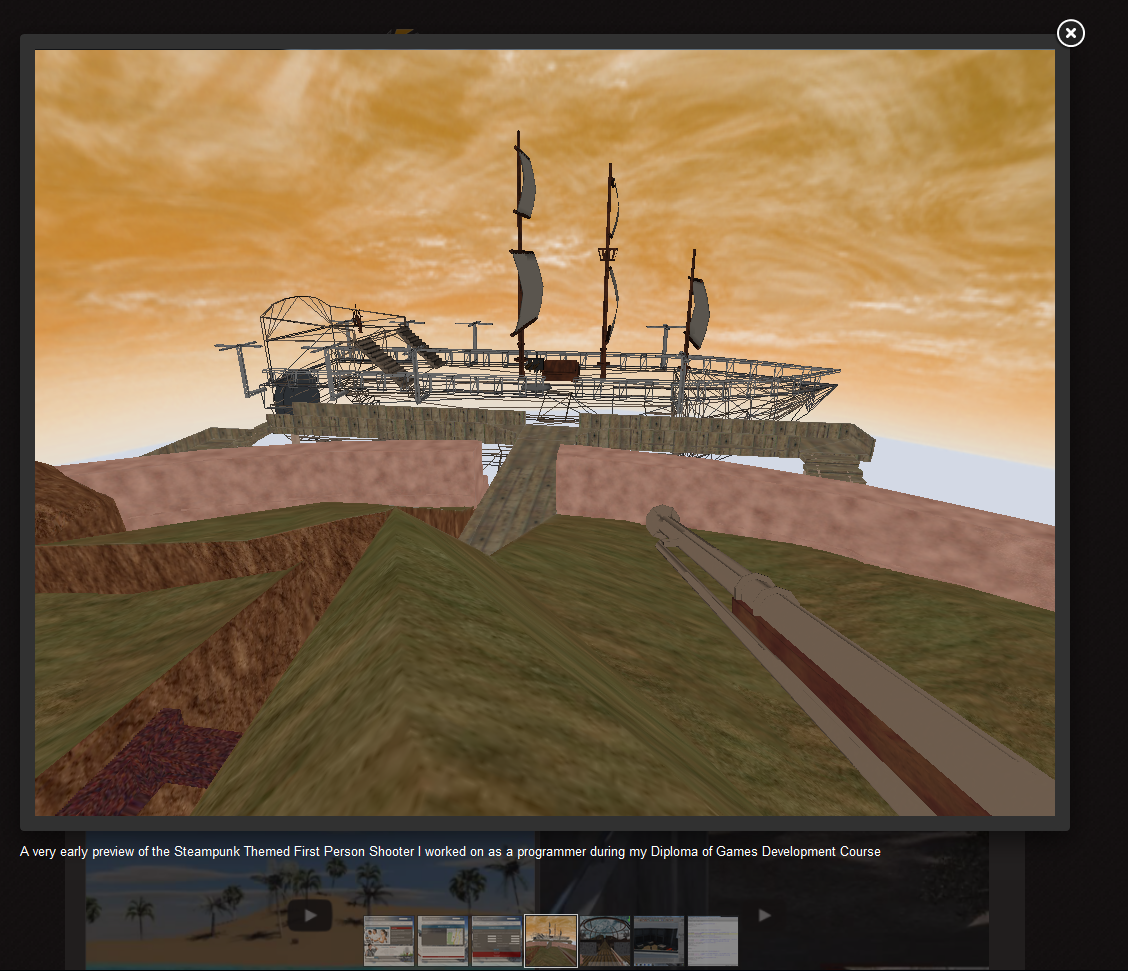
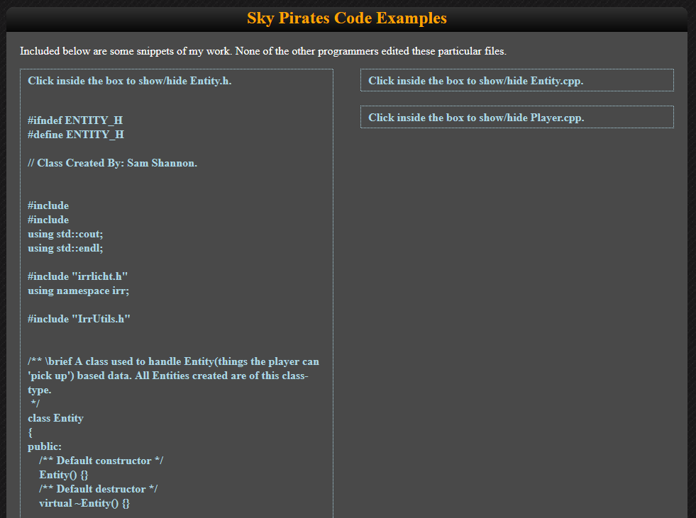
The rest of the site is okay by comparison, though I am also rather fond of the gallery layout (which I have attempted to re-create in spirit on the WordPress site) and the toggling expandable code preview areas.
Updating it was a pain though, even with extensive modularisation through php include snippets. A bunch of copy pasting and editing template snippets for each update was something of a hindrance to my desire to keep it updated with my various projects, so I eventually bade it a fond farewell and moved on to a CMS-based site.
If you still want to potter around on it and see how it works and what it was like, you should be able to view a working version of it here.